Craig Construction Logo Animation
PROJECT OVERVIEW
Craig Construction is a construction and renovation company that wants to build trust in its brand. They are hoping that creating a logo animation will bring awareness to their brand as reputable and valuable. This animation will showcase the services that they offer and capture the viewers attention of potential customers.
MOODBOARD
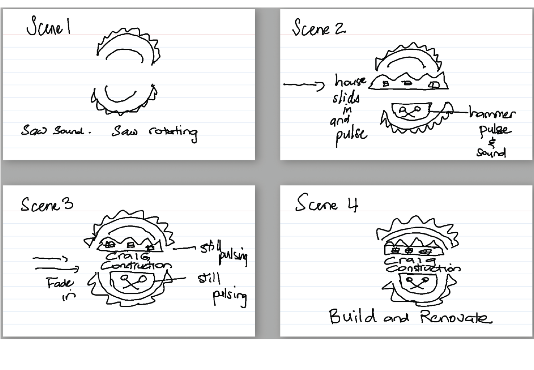
This logo animation sarted as a sketch with 4 keyframes.
ANIMATION FLOW
Craig Construction operates in a sector where trust is established visually before a word is spoken. Their brand needed to communicate weight, permanence, and precision qualities that feel earned, not performed.
The animation direction drew from structural and architectural metaphors: elements constructing themselves into place, clean geometric assembly, deliberate timing. The visual language avoided the obvious construction industry shorthand. Instead, the focus was the logo itself geometry arriving with intention, holding with authority. Colour was restricted to the brand's core palette with a single accent. Restraint at every decision point amplified the logo's presence rather than competing with it.


FINAL ANIMATION
The final animation shows Craig Construction as a reputation and quality company. It shows the process of creating with seamless timing and quality work.
WHAT MOTION TAUGHT ME
Timing in animation works at a scale most designers don’t think about until they’ve gotten it wrong. An element can arrive too fast or too slow and this messes up the timing.
Documentation is crucial and that is creating and having a clear brief. This is where there will be clarity in each frame and is an essential tool to stay on track.
I ask myself these questions: what does success look like and how will everyone perceive this product?