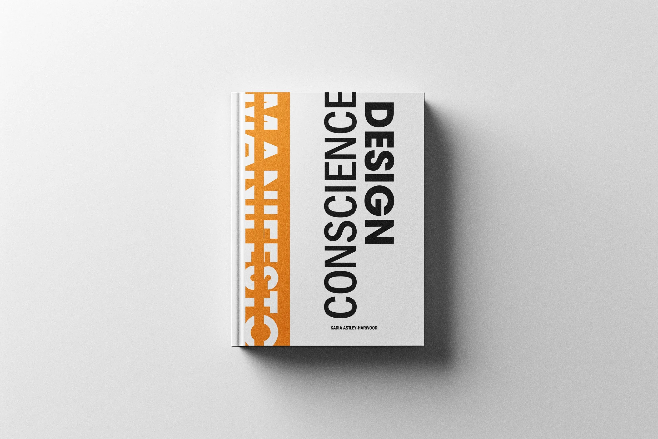
PROJECT OVERVIEW
WHAT IS A DESIGN MANIFESTO?
A manifesto is a declaration of belief made public. For a designer, it's an act of self-examination: What do I stand for? Does my work reflect it? If I traced every design decision I've made back to a value, would I recognize myself?
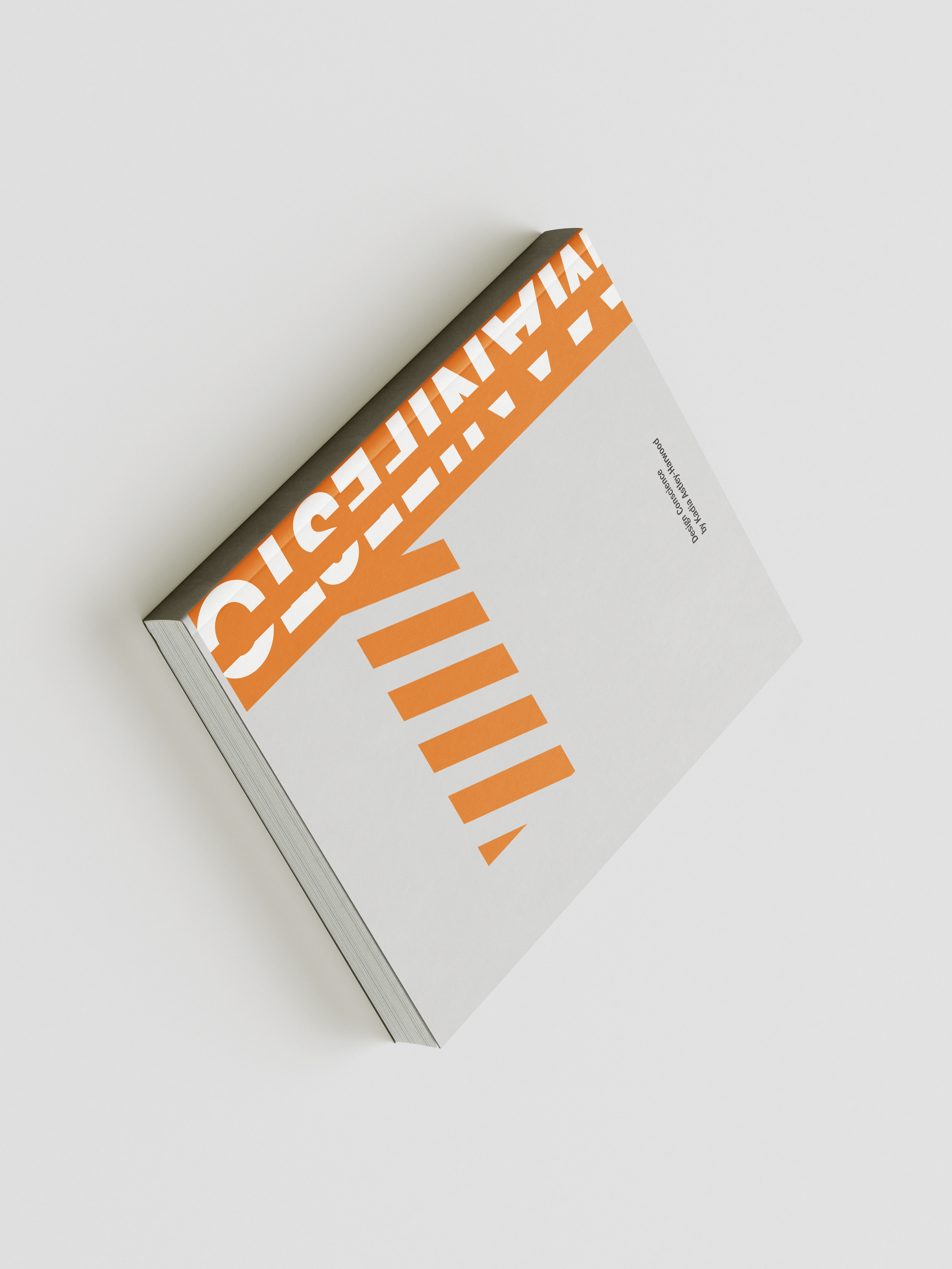
This booklet began as a GIT course assignment. It became something more deliberate: a record of my thinking about the relationship between designers, the systems they work within, and the people those systems affect, whether those people asked to be affected or not. The project demanded I work across two disciplines simultaneously. As a writer, I had to articulate ideas clearly enough to be challenged. As a designer, I had to give those ideas a form that made them harder to dismiss.
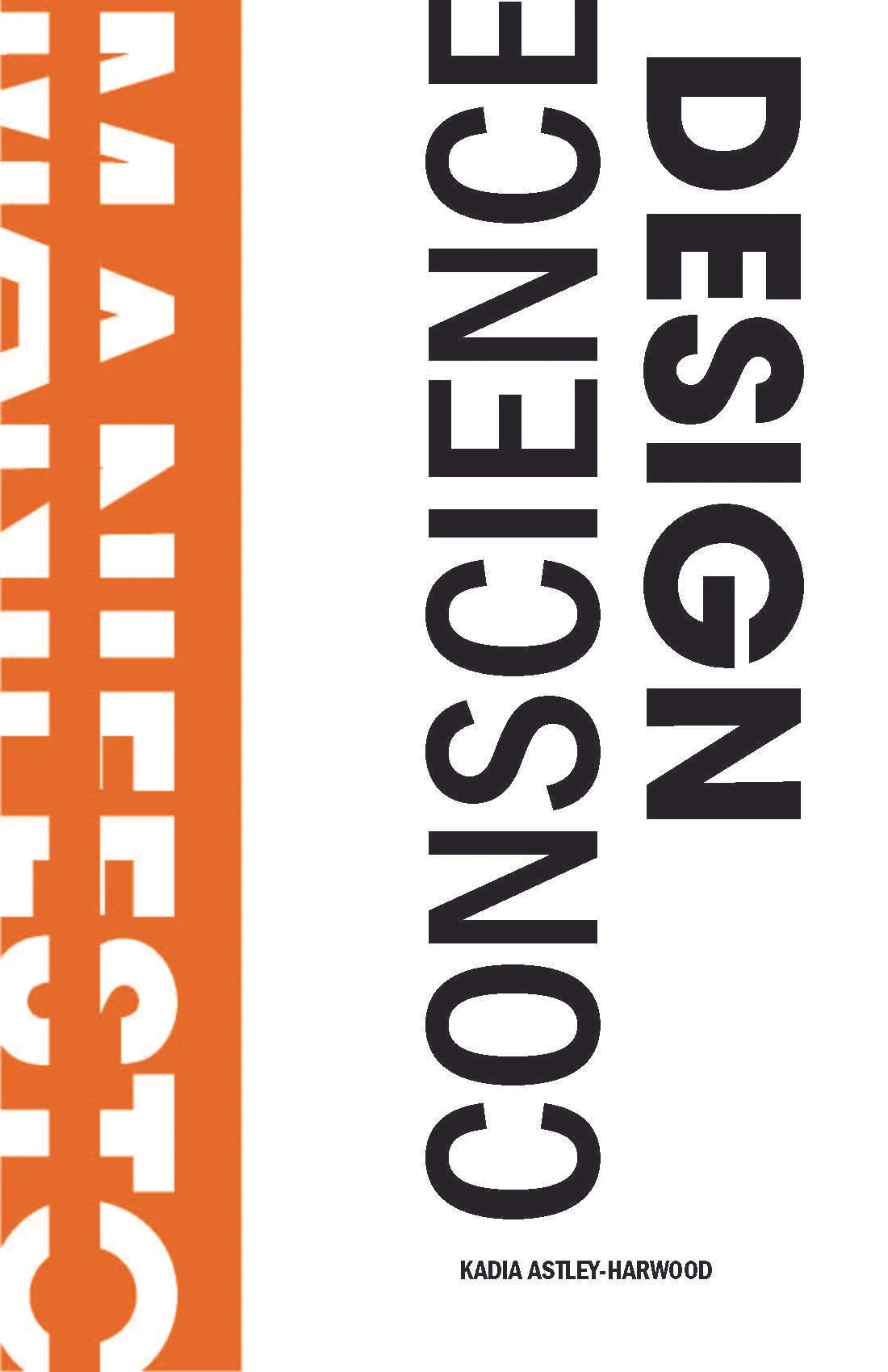
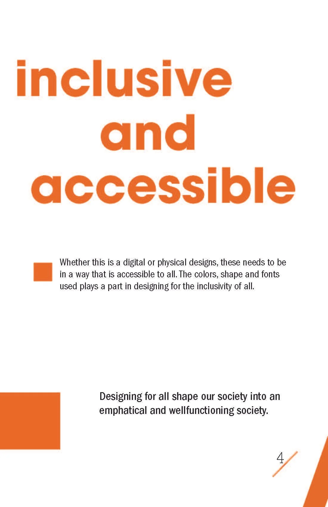
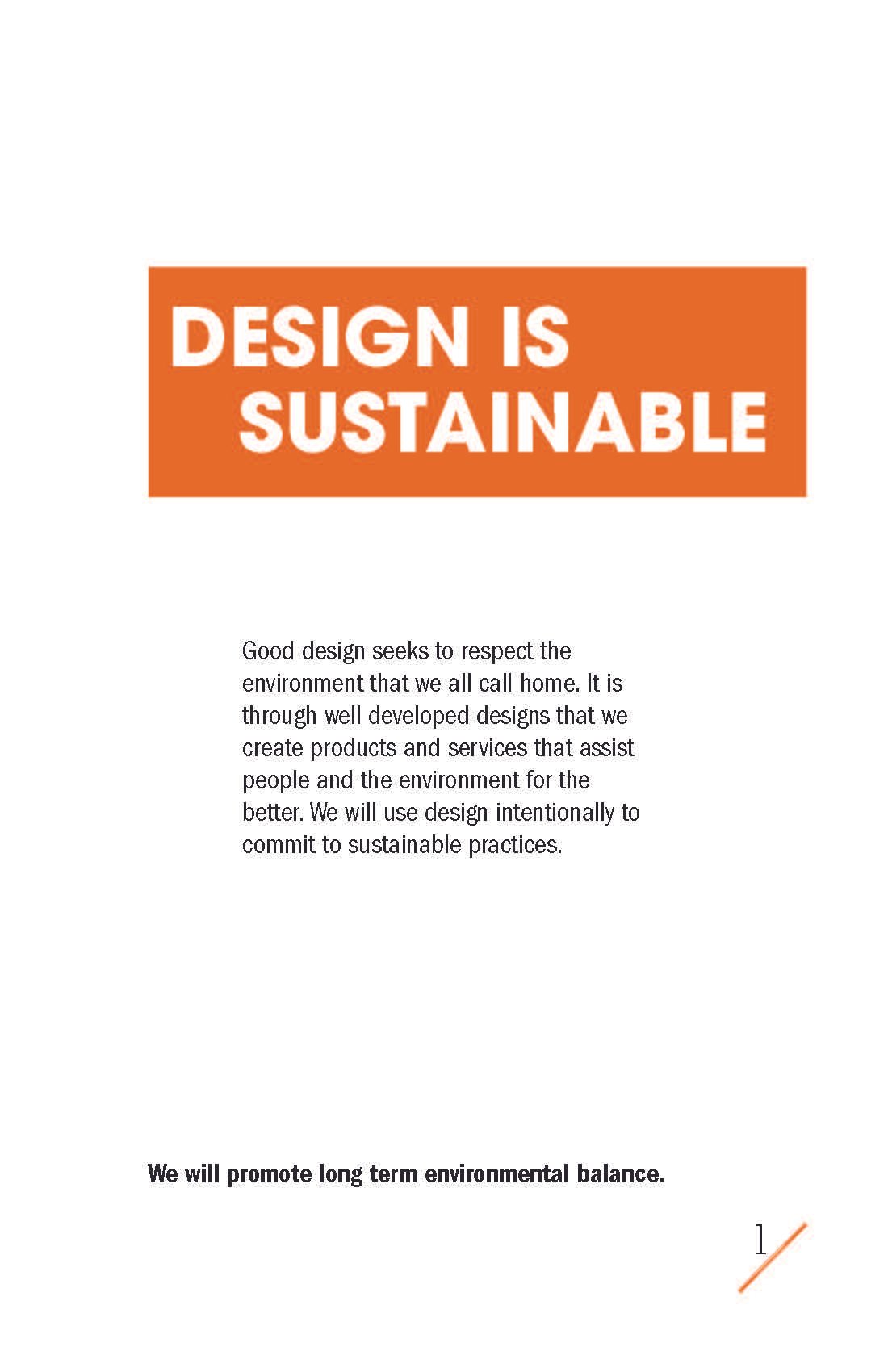
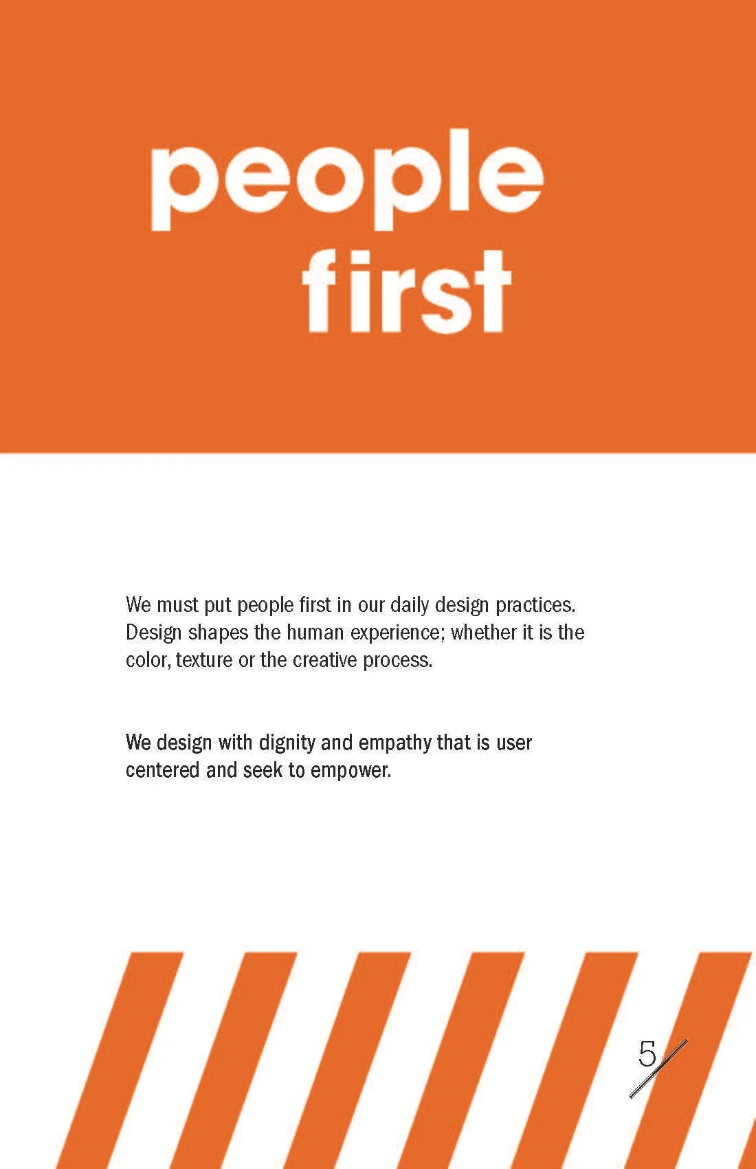
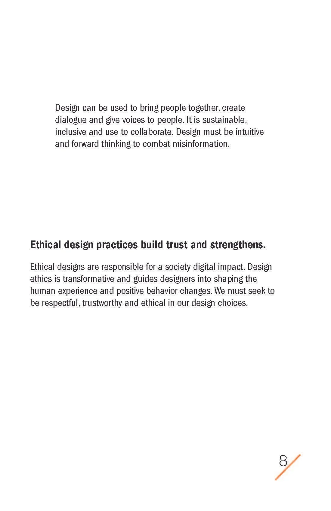
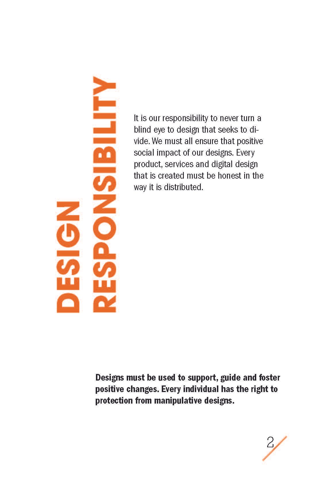
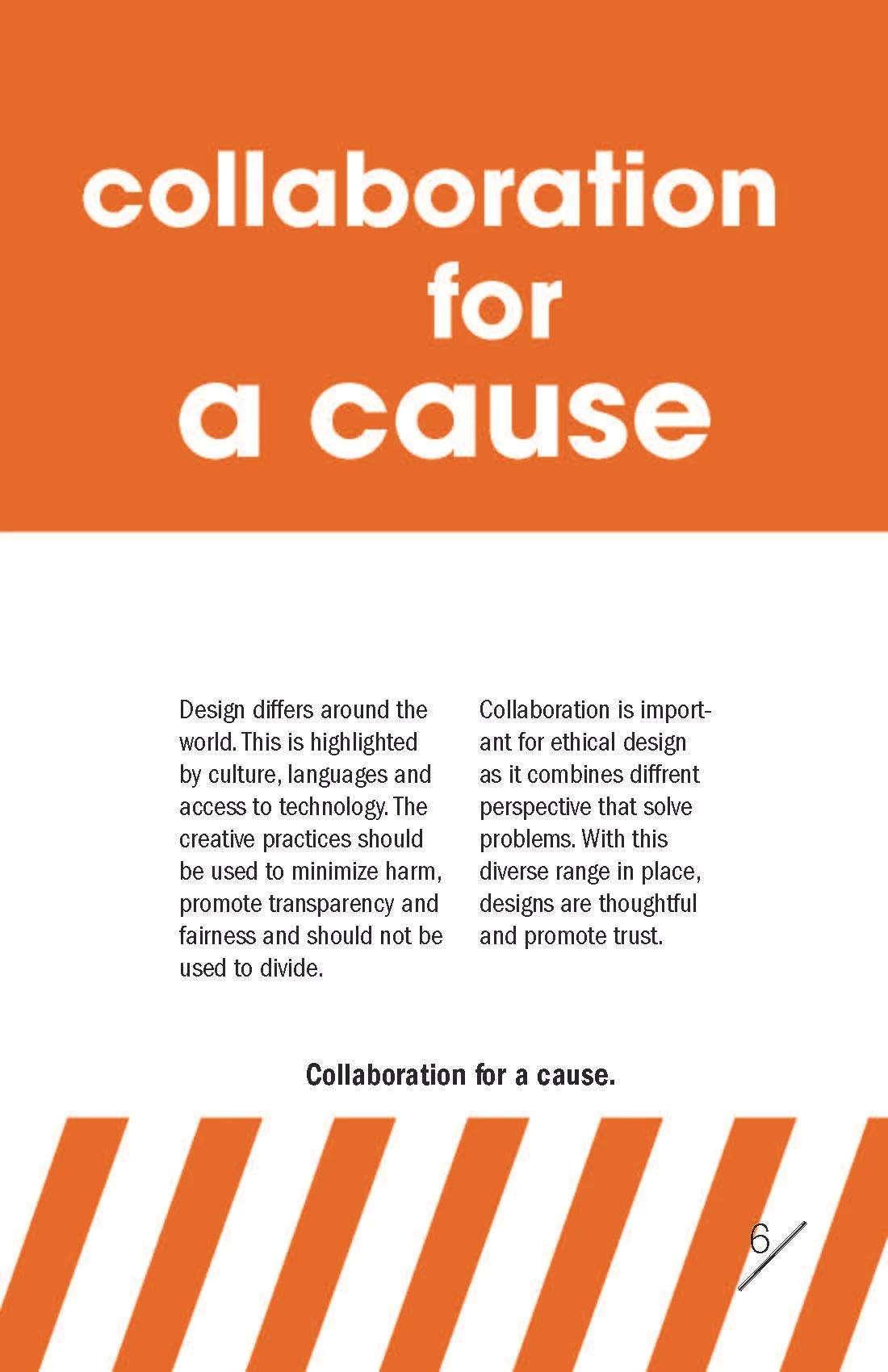
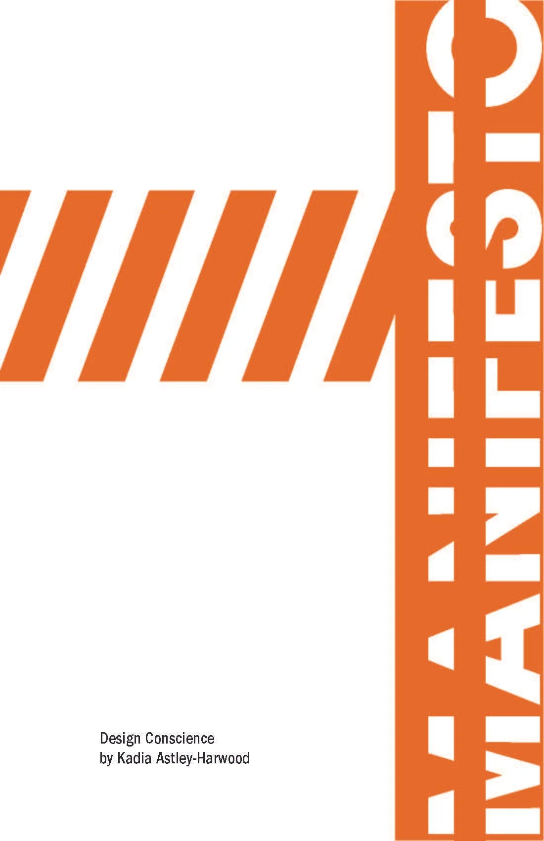
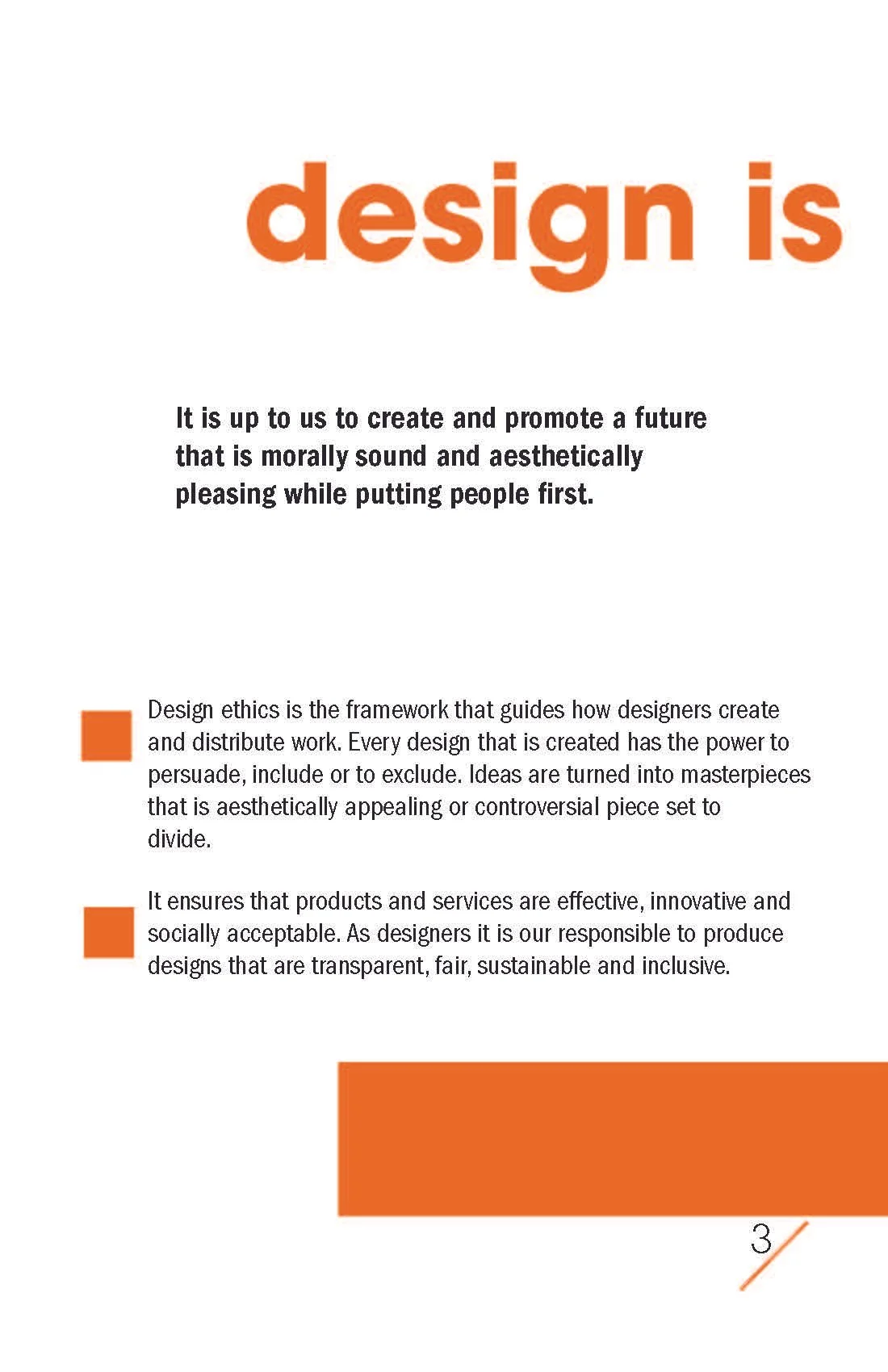
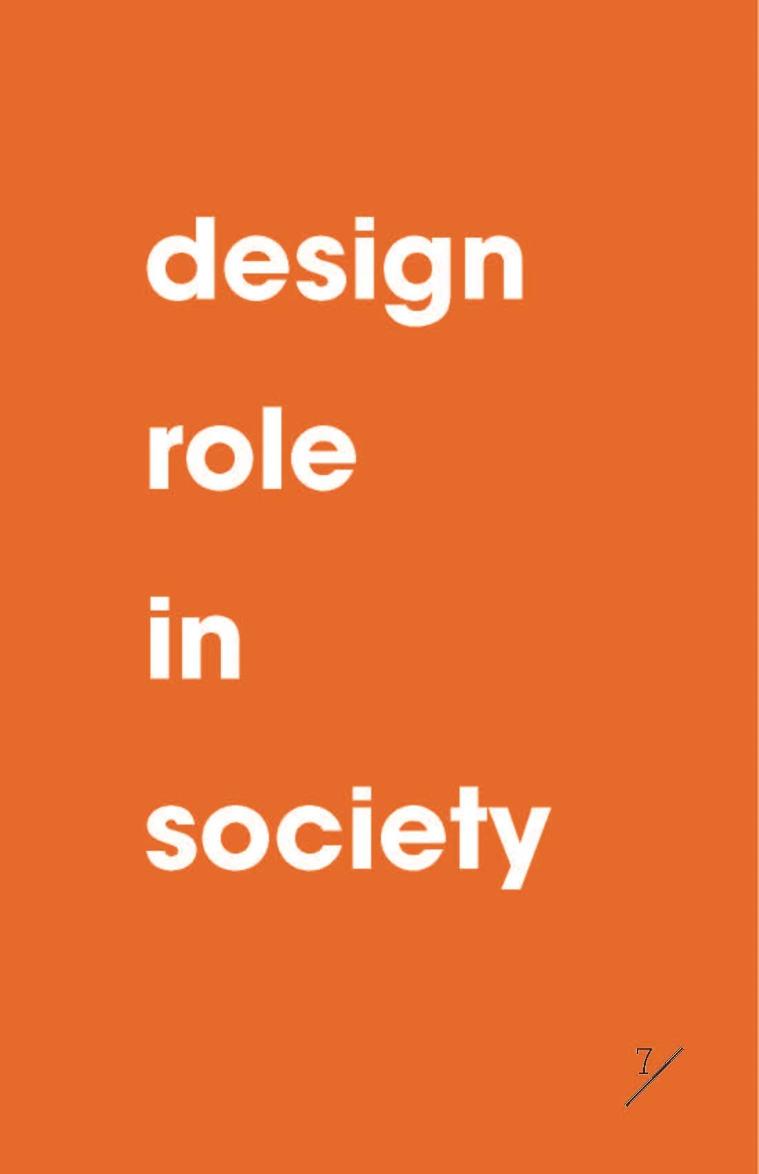
MAKING THE ARGUMENT VISIBLE.
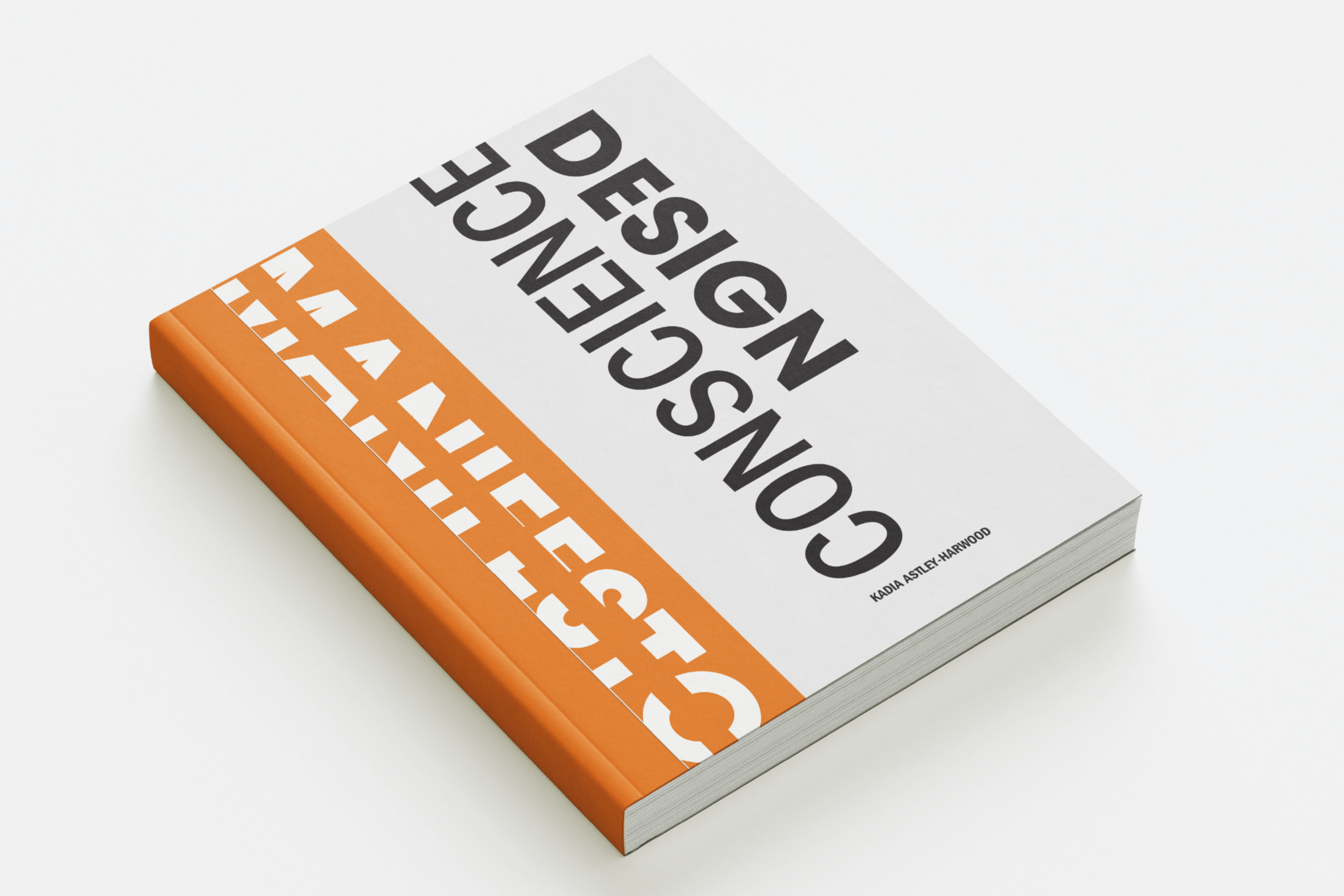
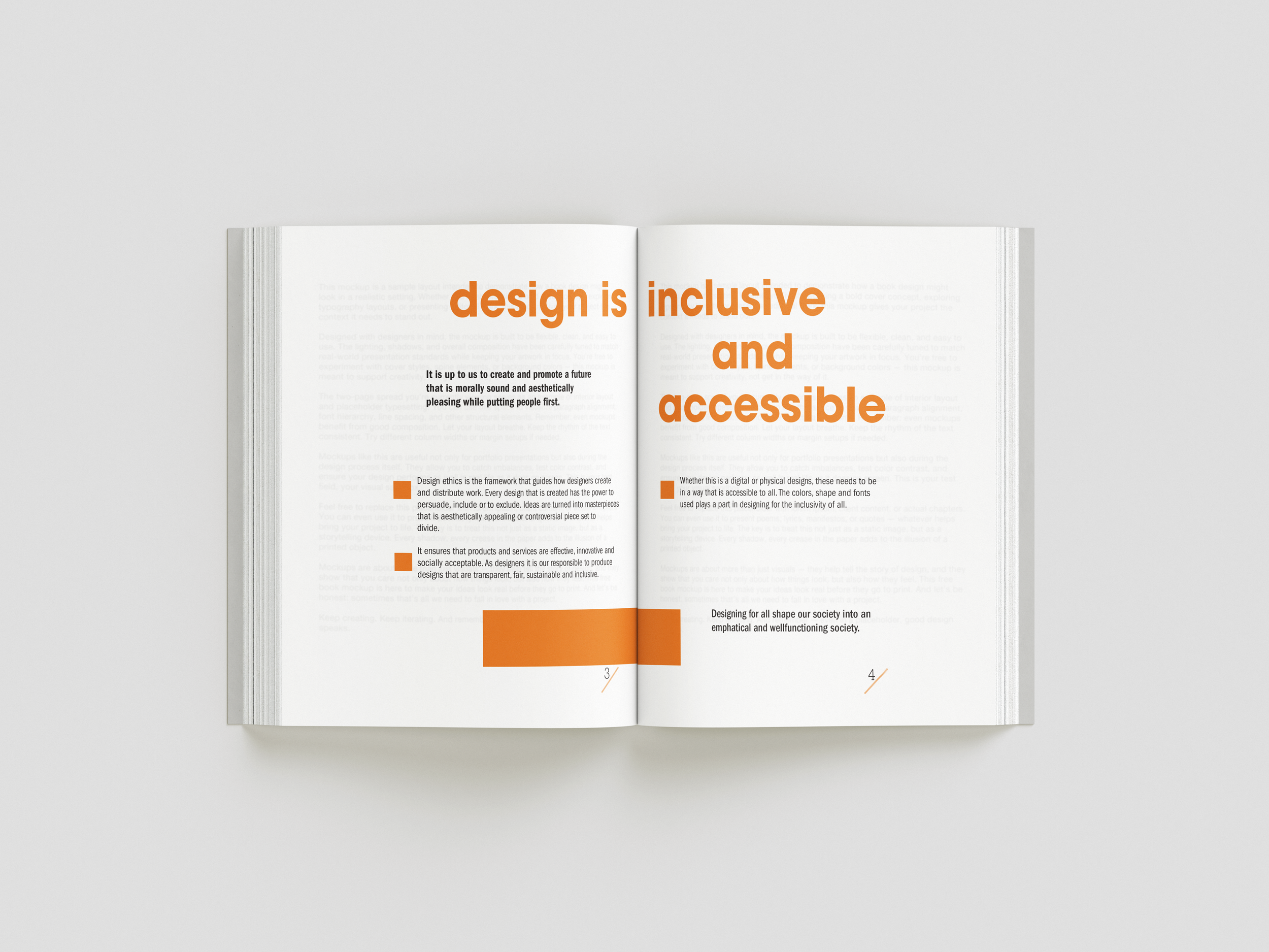
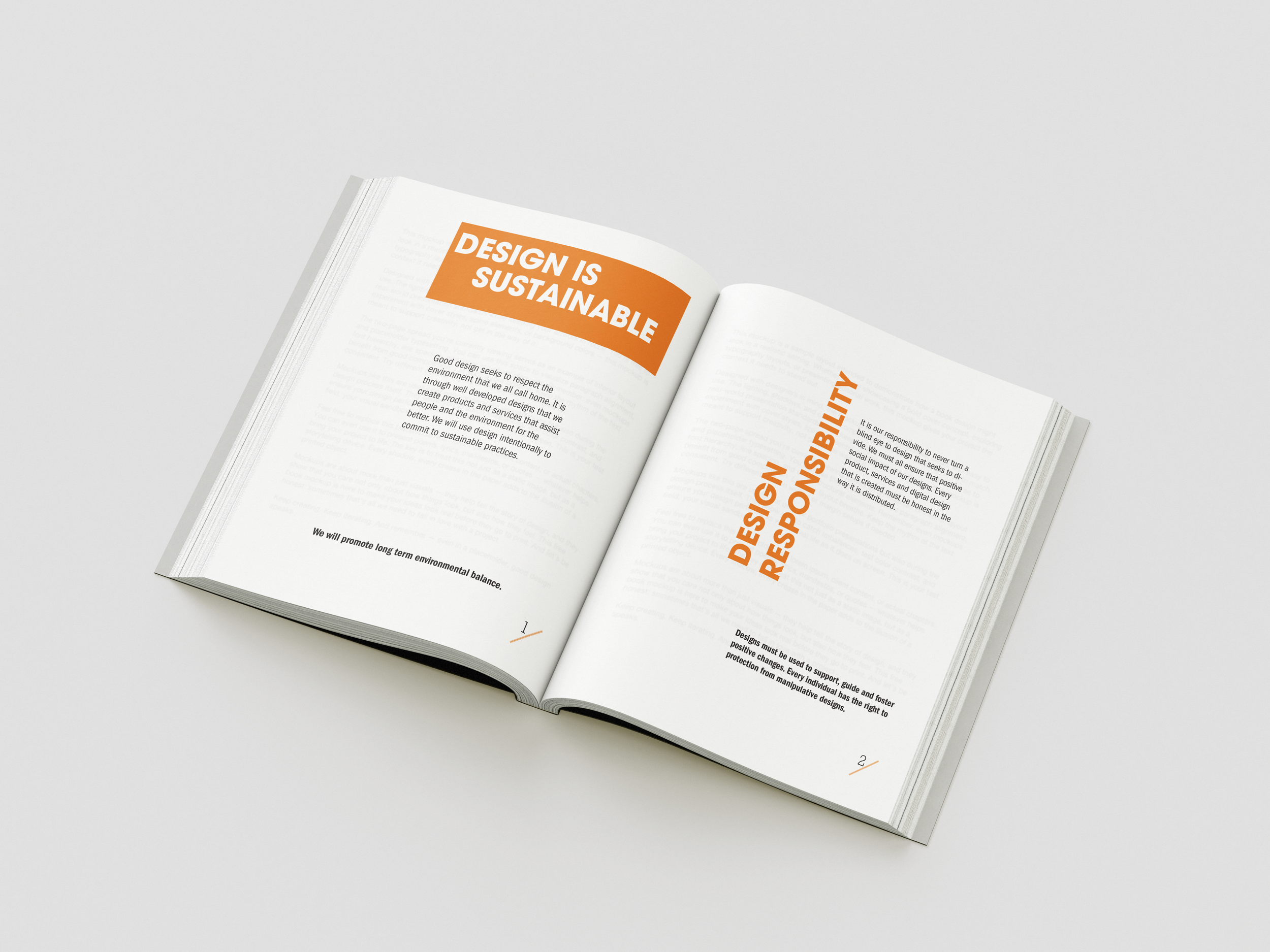
The visual language of the booklet was designed to feel authoritative without feeling corporate. I wanted the object itself to have a point of view to feel like something someone wrote because they meant it, not because they were required to.
The typographic system was built around a single serif display face for headlines and pull-quotes, and a geometric sans for body text and labels. No decorative elements, no illustrative embellishment. The argument had to carry the spread. Grid structure was used as a rhetorical tool: dense, compressed layouts for sections about systemic overwhelm; generous margins for sections about restraint and refusal. The layout performed the content.
WHAT WRITING THIS CHANGED!
Writing a manifesto is uncomfortable. It commits you to positions. It makes your contradictions visible. It requires you to examine the distance between what you believe and what you actually do and to name that distance honestly.
The lasting outcome is a set of questions I now bring to every brief: Who does this design serve? Who does it affect who wasn't asked? What I am being asked to make invisible? These aren't questions that slow the work. They sharpen it.